test slider
Unit 1
What is editorial style?
Definition
‘Editorial style’ is the term used to describe how words, numbers and punctuation are written in cases where there is more than one viable option.
The first three lines of this document exemplify two editorial style points. They show that I have decided:
- to use ‘minimum capitals’ – that is, a capital initial on the first word only of a title
- to use digits not words for the number in ‘Unit 1’
There were other options in both cases. I could have written:
Unit One
What Is Editorial Style?
and that would have been equally acceptable.
Rules and options
The concept of ‘viable alternatives’ is important. In the following sentence the copy-editor has no editorial style decisions to make:
On that momentous, life-changing day, John Brown set off down Albemarle Road, as he did every afternoon from Monday to Friday during the school term, to meet his son Joe from Brookside Academy, a short walk away.
Sentences begin with capital initials and end with full stops; the names of people, days of the week, places and institutions are proper nouns and are capitalised; attributive compounds (‘life-changing’) are hyphenated. These are rules: there are no options. But in the following version of the sentence, things are different:
On 9 October – that momentous, life-changing day – John Brown set off from the White House, Albemarle Road, as he did every afternoon from Monday to Friday in term-time, to meet his son Joe from Brookside Academy, ten minutes’ walk away.
In this version, editorial style decisions needed to be made about:
- numbers (‘9 October’ rather than – say – ‘October 9th’, and ‘ten minutes’ walk’ rather than ’10 minutes’ walk’)
- the character to be used for the parenthetical dash (a spaced en-rule, not a closed em-rule)
- the capitalisation and punctuation of house names (a lower-case initial on the definite article and no quotation marks, when one could capitalise ‘the’ and put the name in quotes)
- the hyphenation of ‘term-time’ (which might also be styled ‘term time’ or, according to the Collins online dictionary, ‘termtime’).
Consistency
Editorial style controls all aspects of consistency in the presentation of words, numbers and punctuation. Most copy-editors realise that consistency is important, but they may not always understand why.
- Inconsistency is or may be distracting to the reader: s/he may be so irritated by noticing ‘organise’ in one line and ‘recognize’ in the next as to lose the thread of the argument.
- Inconsistency may undermine the credibility of the content: if the author cannot decide whether or not to capitalise ‘Professor of Ancient History’ or ‘chief operating officer’, perhaps s/he is not very reliable, either, about names and dates.
- Inconsistency may affect the reputation of the publisher: a well-turned-out text is the very least any company or organisation in the communications business should aspire to.
Now work Exercise 1.
Brief for Exercise 1
- Download this short passage of text in Word from a guidebook to English churches; save the file to your desktop with a new name.
- Go through the text and highlight instances of discrepancy. Use a different colour for each type of inconsistency: for example, yellow for inconsistent capitalisation, blue for instances of inconsistent spelling or hyphenation, green for issues relating to abbreviations, magenta for punctuation, and so on.
- Check your results by clicking on the slider below to see a worked version and a commentary.
Click on the image below to download the marked up version and commentary.
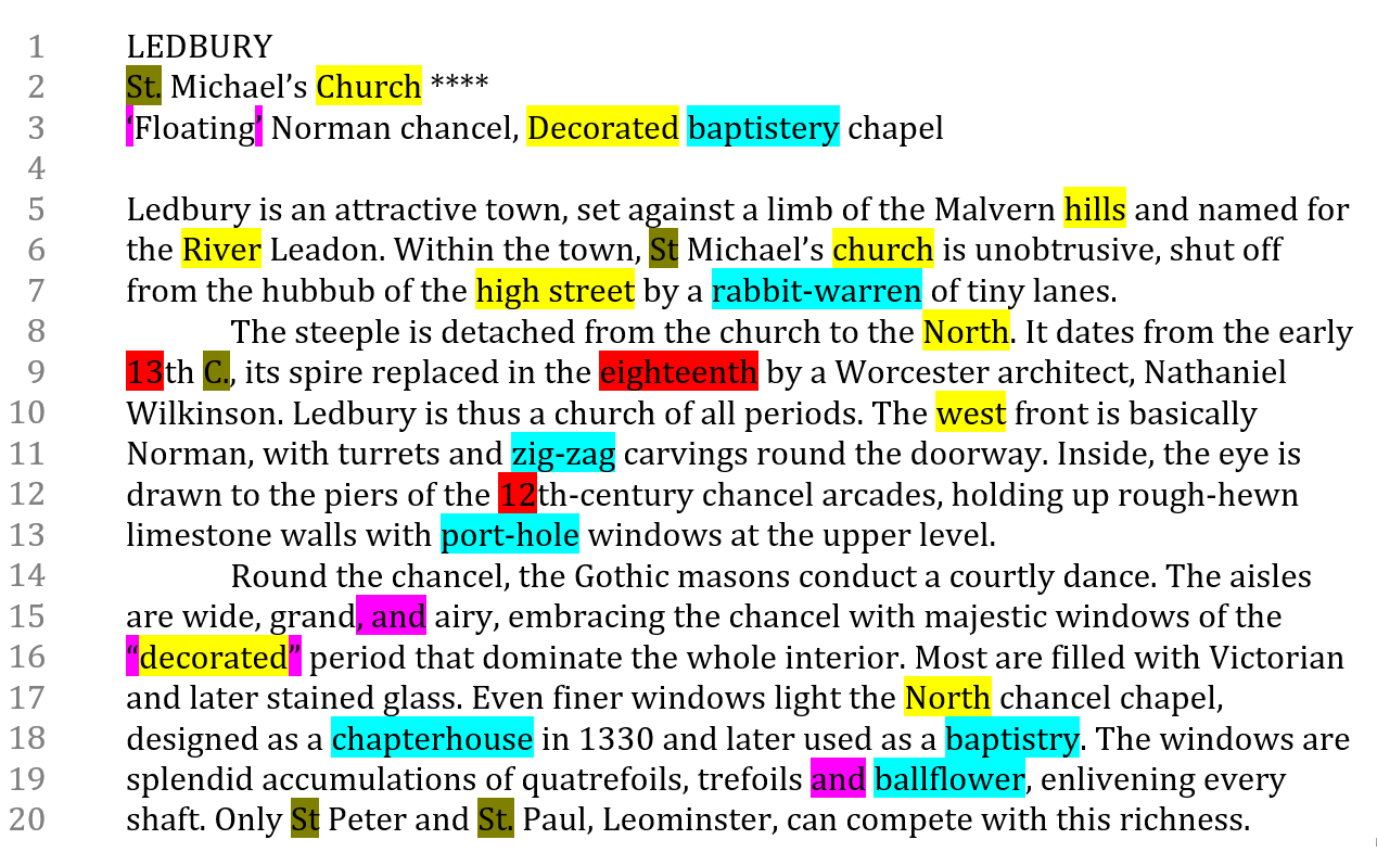
Commentary
Did your marked-up version of Exercise 1 look like a rainbow? This commentary lists the discrepancies you should have highlighted and explains the decisions you might make to resolve them. We shall revert to the reasoning behind these decisions in later units. (Note that issues to do with italic type did not come up in this text.)
spelling and hyphenation
| baptistery / bapistry |
Although the former spelling is common and the latter less so, both are viable. It would probably be best to choose the more common version.
|
| rabbit-warren / rabbit warren zig-zag / zigzag port-hole / porthole chapterhouse / chapter house /chapter-house ballflower / ball flower / ball-flower |
There is no reason to hyphenate ‘rabbit warren’, and a glance at online hits shows no instances with a hyphen. The author seems to favour hyphens – see the similarly rare ‘zig-zag’ in line 11 and ‘port-hole’ in line 13. None of these is exactly wrong, but they contrast oddly with ‘chapterhouse’ in line 18 and ‘ballflower’ in line 19. An authoritative source would suggest these forms: ‘rabbit warren’, ‘zigzag’ and ‘porthole’, and following that lead you could leave ‘chapterhouse’ and ‘ballflower’ unchanged. |
| single / double quotation marks |
The text has single quotation marks in line 3 and doubles in line 16. In real life, the decision would probably not be yours, as it is almost bound to be catered for by the house style.
|
| serial / no serial comma |
In line 15 there is a serial comma but the list in line 19 lacks one. Again, the house style would probably decide this for you. |
| Church / church |
It would be usual to capitalise the whole name ‘St Michael’s Church’ but, in a context where such names happen on every page, it might be better not to (too many capital initials tend to bludgeon the reader’s eye in heavily factual text). In making a decision, you would also need to consider other forms such as ‘the Church / church of St Peter and St Paul’.
|
| Decorated / 'decorated' |
In one case, the name of this architectural style is capitalised and in the other set in quotation marks with a lower-case initial. If you check authoritative source, you will find that it should be capitalised (like Gothic in line 14).
|
| Malvern hills / River Leadon |
The discrepancy here is disguised, as in one case the critical element follows the proper name and in the other it precedes. The form ‘river Leadon’ would be quite unusual, so it would be better here to capitalise ‘hills’. Such a decision would come up again and again in the book, in references to rivers, estuaries, hills, downs, valleys, mountains, etc.
|
| North / west |
Authors are often tempted to capitalise points of the compass, particularly in specialist contexts like this. However, especially as ‘north’, ‘south’, ‘east’ and ‘west’ will come up frequently in a book about churches (which will anyway contain plenty of capital initials), it would be better to go for lower-case initials for both adjectival and nominal forms of these words.
|
| 13th / eighteenth / 12th |
It looks as though ‘eighteenth’ in line 9 is the aberration in this case. As the text will repeatedly refer to centuries, it would be best to use digits for them, even though other numbers may conform with a rule to spell out up to and including ‘ninety-nine’. |
| St. / St |
The first of these forms is not ‘wrong’, but it is rare in British style (see Unit 2 for a discussion of British and American style). Impose ‘St’ without the full point across the board.
|
| C. / century |
There would be some justification for deciding to abbreviate ‘century’ to ‘C.’ when it occurs with a number, as the form will come up often. But the spelt-out version predominates in the extract, and, if this were typical of the text as a whole, it would be better to alter the anomalous example. |
and the other type
Click on the image below to download the marked up version and commentary.
Commentary
Did your marked-up version of Exercise 1 look like a rainbow? This commentary lists the discrepancies you should have highlighted and explains the decisions you might make to resolve them. We shall revert to the reasoning behind these decisions in later units. (Note that issues to do with italic type did not come up in this text.)
spelling and hyphenation
| baptistery / bapistry |
Although the former spelling is common and the latter less so, both are viable. It would probably be best to choose the more common version.
|
| rabbit-warren / rabbit warren zig-zag / zigzag port-hole / porthole chapterhouse / chapter house /chapter-house ballflower / ball flower / ball-flower |
There is no reason to hyphenate ‘rabbit warren’, and a glance at online hits shows no instances with a hyphen. The author seems to favour hyphens – see the similarly rare ‘zig-zag’ in line 11 and ‘port-hole’ in line 13. None of these is exactly wrong, but they contrast oddly with ‘chapterhouse’ in line 18 and ‘ballflower’ in line 19. An authoritative source would suggest these forms: ‘rabbit warren’, ‘zigzag’ and ‘porthole’, and following that lead you could leave ‘chapterhouse’ and ‘ballflower’ unchanged. |
| single / double quotation marks |
The text has single quotation marks in line 3 and doubles in line 16. In real life, the decision would probably not be yours, as it is almost bound to be catered for by the house style.
|
| serial / no serial comma |
In line 15 there is a serial comma but the list in line 19 lacks one. Again, the house style would probably decide this for you. |
| Church / church |
It would be usual to capitalise the whole name ‘St Michael’s Church’ but, in a context where such names happen on every page, it might be better not to (too many capital initials tend to bludgeon the reader’s eye in heavily factual text). In making a decision, you would also need to consider other forms such as ‘the Church / church of St Peter and St Paul’.
|
| Decorated / 'decorated' |
In one case, the name of this architectural style is capitalised and in the other set in quotation marks with a lower-case initial. If you check authoritative source, you will find that it should be capitalised (like Gothic in line 14).
|
| Malvern hills / River Leadon |
The discrepancy here is disguised, as in one case the critical element follows the proper name and in the other it precedes. The form ‘river Leadon’ would be quite unusual, so it would be better here to capitalise ‘hills’. Such a decision would come up again and again in the book, in references to rivers, estuaries, hills, downs, valleys, mountains, etc.
|
| North / west |
Authors are often tempted to capitalise points of the compass, particularly in specialist contexts like this. However, especially as ‘north’, ‘south’, ‘east’ and ‘west’ will come up frequently in a book about churches (which will anyway contain plenty of capital initials), it would be better to go for lower-case initials for both adjectival and nominal forms of these words.
|
| 13th / eighteenth / 12th |
It looks as though ‘eighteenth’ in line 9 is the aberration in this case. As the text will repeatedly refer to centuries, it would be best to use digits for them, even though other numbers may conform with a rule to spell out up to and including ‘ninety-nine’. |
| St. / St |
The first of these forms is not ‘wrong’, but it is rare in British style (see Unit 2 for a discussion of British and American style). Impose ‘St’ without the full point across the board.
|
| C. / century |
There would be some justification for deciding to abbreviate ‘century’ to ‘C.’ when it occurs with a number, as the form will come up often. But the spelt-out version predominates in the extract, and, if this were typical of the text as a whole, it would be better to alter the anomalous example. |
Core areas
The styling of words, numbers and punctuation should be understood in the broadest possible sense, as it controls editorial decision-making at many different levels. You may find yourself having to determine quite complex matters, such as the style for bibliographical citations or the form of references in the text to figures, tables and illustrations, but more often you will be deciding quite small matters, such as where to use capital initials or insert hyphens, and whether ‘%’ or ‘per cent’ (or even ‘percent’) is preferable.
This course focuses on the core areas of editorial style. When you have mastered those, you will be equipped to think through more complicated aspects of styling for yourself. The components of editorial style we shall cover are:
- spelling and hyphenation
- punctuation
- capitalisation
- italic / roman / quotation marks
- numbers
- abbreviations
House style
The term ‘house style’ is sometimes used as a synonym for ‘editorial style’, but this is misleading. In most cases, the house style of a publisher, imprint, company or organisation covers only the commonest issues, such as the choice of -ise or -ize endings and single or double quotation marks.
A house-style sheet is typically short – sometimes no more than a side of A4 – and often not very well organised. Here is one from an academic publisher (Example 1).
While this house-style sheet gives the copy-editor a start, you can see that it is mostly quite general: any book-length script will require hundreds of decisions during editing that it does not cater for. So house style is often a very small and basic sub-set of editorial style generally.
On the other hand, some house-style manuals are very detailed and run to scores of pages. A detailed house style is needed for any kind of ‘series’ publishing – the individual units of an e-learning course, the issues of a newspaper, the volumes of a large reference work, the reports of an NGO, the newsletters of a charity. If a reader is likely to consult multiple items in the ‘series’, it is important for the items to be consistent with one another, and this leads to an ever expanding style sheet.
Most publishers, companies and organisations ask copy-editors to impose their house style ruthlessly. There may be good reasons for this:
- The house style is a convenient set of rules: if everyone applies them, no time is wasted ‘reinventing the wheel’.
- The house style is part of the brand: whether or not readers notice this aspect of branding, adherence to the house style promotes consistency across all the documents and publications put out by a publisher, organisation or institution.
However, there may be good reasons to challenge the assumption that every publication must adhere to the house style:
- House style is simply a tool to save you having to make basic decisions: it is useful, but not ‘right’.
- Adherence to house style is less important than consistency within the publication: there may be reasons why the house style is unsuited to the content of a particular text.
- The author may already have used a consistent style: it will be better to standardise on that than to undo good work so as to impose the house style.
Where there is a good case for setting aside the house style, seek the project manager’s permission to do so.
Other meanings of 'style'
An organisation’s brand is dependent on features that are more readily recognised than spelling style or capital initials. Its logo, the masthead on its website, the typeface it uses, its characteristic application of colour – all these contribute to its ‘style’ and define it to its users or clients.
In a narrower sense, publishers and other purveyors of information often have a standard approach to typography and layout. This is likely to control everything from the look of the page – how lists, quotations, running heads and other textual features are positioned – to a less easily defined but distinctive general ‘design style’.
As a copy-editor, you are almost certain to have encountered ‘styles’ in the sense of named typographic formats that can be accessed from the ‘Styles’ menu in Word. By selecting a few words or a passage of text with the cursor and applying a ‘style’ to it – ‘A head’ or ‘Paragraph 1’, for instance –you can impose on that component a typeface, size, spacing and position on the page.
All three of these meanings of ‘style’ have more to do with the physical design and appearance of the text than with how words, numbers and punctuation are written. Always try to think clearly about the sense in which you use the word ‘style’ when you discuss or describe aspects of the publishing process. In this course, we are concerned exclusively with ‘editorial style’; unless otherwise explicitly stated, ‘style’ refers to the presentation of words, numbers and punctuation.